8 Must-Know Best Practices for Responsive Web Design in 2026
Published: September 17th, 2024 | Last Updated: March 3rd, 2026
By Ainal Haq
- What is Responsive Web Design and Why It Matters
- Core principles of responsive web design
- 8 Best Practices for Responsive Web Design
- How to Enhance User Experience with Responsive Design
- Tools for Building and Testing Responsive Web Designs
- CSS Frameworks for Responsiveness
- Common Challenges in Responsive Web Design
- The Importance of SEO in Responsive Web Design
- Future Trends in Responsive Web Design
- Final Words

With more people browsing the web on their phones and tablets these days, it’s more important than ever for websites to adapt to different screen sizes.
That’s where Responsive Web Design (RWD) comes in. It allows websites to automatically adjust to fit any device, giving users a smooth experience whether they’re on a smartphone, tablet, or desktop.
As more of us rely on our mobile devices for everyday browsing, having a mobile-friendly website isn’t just a nice-to-have—it’s essential.
A site that’s easy to navigate and quick to load will keep visitors happy and coming back.
Plus, a well-designed responsive website can do wonders for your business by improving user satisfaction and helping you stay competitive online.
Let’s jump in!
What is Responsive Web Design and Why It Matters

Responsive Web Design (RWD) is a way of building websites that automatically adapt to different devices and screen sizes. Whether someone visits your site on a phone, tablet, or desktop, they’ll get a consistent, smooth experience.
Instead of creating multiple versions of your site, responsive design uses flexible layouts that adjust based on the device. It relies on tools like media queries (which detect screen size) and scalable content (like images and text that resize).
With more people using mobile devices, responsive design is essential. Google even uses mobile-first indexing, meaning it prioritizes the mobile version of your site for search rankings. So, having a mobile-friendly site can boost your SEO and improve the overall user experience, encouraging visitors to stay and engage with your content.
Core principles of responsive web design
Responsive web design is built on several key principles that ensure a website adjusts smoothly across different devices and screen sizes.
By implementing these principles, web designers can create sites that offer a consistent, user-friendly experience for everyone—whether they’re browsing on a mobile phone, tablet, or desktop.
Below are the core principles that make responsive web design effective and help websites function properly across all platforms.
1. Fluid grid layouts
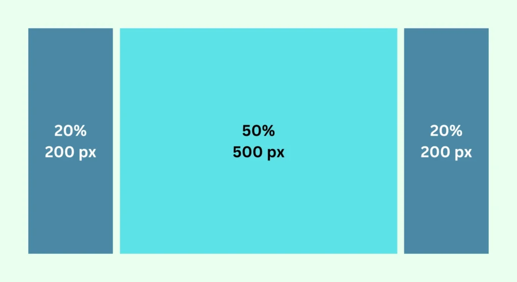
A fluid grid system is an essential part of responsive web design. Instead of using fixed sizes (like pixels) to decide the size of elements such as text, images, and buttons, a fluid grid uses flexible units like percentages.
This allows the content on your website to automatically adjust based on the size of the screen. So, whether a user is on a mobile phone, tablet, or desktop computer, the website elements resize and realign themselves to fit perfectly.
This makes your site look balanced and neat, no matter what device it’s viewed on.
2. Breakpoints and responsive breakpoints
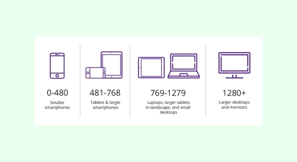
Breakpoints are specific screen widths where the layout of your website changes to fit different devices. For example, a common breakpoint for –
- Mobile screens is 320 pixels wide,
- For tablets it’s 768 pixels, and
- For desktop screens, it’s around 1024 pixels.
By defining these breakpoints, your website can switch to a different layout that works better for each screen size.
This ensures that your visitors get a user-friendly experience on any device, as the website will adjust itself to look good and function properly on all screens.
3. Flexible media and images

When designing a responsive website, it’s important that images and videos also adjust to different screen sizes.
Large images or videos can make a site load slowly or appear awkward on smaller screens if not optimized correctly. To handle this, the CSS property max-width: 100% is often used.
This ensures that images automatically shrink to fit smaller screens without losing their quality. Additionally, media queries help ensure that images are displayed correctly for different screen resolutions, ensuring a smooth and consistent experience across all devices.
Viewport meta tag

The viewport meta tag is a simple but crucial part of responsive web design. It tells the browser how to adjust the webpage according to the device’s screen size.
For example, on mobile devices, the viewport meta tag ensures that the page fits the screen correctly, without users needing to zoom in or scroll horizontally. By setting the viewport, you can control how a webpage is scaled and displayed, providing a better experience on mobile devices.
8 Best Practices for Responsive Web Design
Creating a responsive website goes beyond just adjusting layouts for different screen sizes. By following specific best practices, you can ensure your website is not only functional but also provides a great experience for users on all devices. Below are key practices to follow:
1. Mobile-first design approach
A mobile-first design strategy involves designing your website starting from the smallest screens (like smartphones) and then scaling up for larger screens like tablets and desktops. This method ensures that your website works smoothly on mobile devices, which are now responsible for a significant portion of web traffic.
According to Google’s mobile-first indexing, Google primarily ranks websites based on their mobile versions. Therefore, starting with a mobile-first design improves SEO and ensures that mobile users have a seamless experience. Once the mobile version is optimized, the design can be expanded for larger screens.
2. Touch-friendly navigation
With the increasing use of mobile devices, navigation should be optimized for touch screens. Users on mobile phones and tablets rely on touch gestures rather than a mouse, so it’s important to make buttons, links, and other interactive elements easy to tap.
This means using larger buttons and leaving enough space between them to avoid accidental clicks. Additionally, avoid using hover-based navigation, which doesn’t work well on mobile. Simplified menus with clear, clickable elements improve navigation and reduce user frustration, making the website more user-friendly.
3. Flexible typography
Just as images need to adjust for different screen sizes, typography should be flexible as well. On smaller screens, large fonts can take up too much space, while on larger screens, tiny fonts may be hard to read.
By using relative units like em or rem for font sizes, text can scale appropriately based on the screen size, ensuring that it is always readable and visually appealing. This improves readability across all devices without requiring constant adjustments to font sizes.
4. Consistent layout across devices
It’s important to maintain a consistent layout across different devices. While the layout may need to adjust for different screen sizes, the overall design, style, and structure should remain uniform. This gives users a familiar experience whether they are browsing on a mobile phone, tablet, or desktop. Using CSS frameworks like Bootstrap or Foundation can help achieve this consistency.
These frameworks provide pre-built responsive components like grids, buttons, and navigation bars that automatically adjust to different screen sizes while maintaining a consistent look.
5. Optimized images and media
Images and media should be optimized for responsive websites to ensure that they don’t slow down load times, especially on mobile devices. Large images can take a long time to load, which can lead to higher bounce rates, especially for mobile users.
Using responsive images that adapt to different screen sizes is crucial. The srcset attribute in HTML allows you to provide different image sizes for different devices, ensuring fast load times and high-quality visuals. Additionally, using lazy loading can help by only loading images when they are about to enter the viewport, further improving performance.
6. Efficient use of media queries
Media queries are a key part of responsive design, allowing your website’s layout and content to adapt based on the device’s screen size. By applying media queries, you can control how elements like fonts, grids, and images appear on different devices.
For example, a three-column layout may look great on a desktop but be too cramped on a mobile device, so a media query can adjust this to a single column for smaller screens. Media queries ensure that your design is tailored to different devices, providing a better user experience.
7. Faster load times
Page load speed is critical, especially for mobile users. Studies show that users are more likely to leave a website if it takes more than three seconds to load.
To ensure fast load times, minimize the size of images and videos, reduce the number of HTTP requests, and use modern web technologies like lazy loading and content delivery networks (CDNs). Optimizing your site for faster load times improves user experience and also benefits your SEO, as search engines favor faster websites.
8. Testing across multiple devices
Testing your website’s responsiveness across multiple devices is a crucial step. Tools like Chrome DevTools or BrowserStack allow you to simulate how your website will look and behave on different devices, including phones, tablets, and desktops.
This helps identify any issues with layout, typography, or navigation that might affect the user experience. Consistent testing ensures your site functions well on all screen sizes and prevents potential problems from affecting your audience.
How to Enhance User Experience with Responsive Design
A responsive design isn’t just about making a website look good on different devices. It’s also about ensuring that users have a smooth and enjoyable experience, regardless of whether they’re using a phone, tablet, or desktop.
Let’s explore how responsive design can improve the user experience by focusing on load times, screen resolutions, and performance metrics.
Improving load times
One of the most important aspects of user experience is load time—how quickly your website appears on the screen after someone clicks on it. If your website takes too long to load, visitors may get frustrated and leave. This is especially true for mobile users who expect fast results.
To make your site load faster, it’s essential to optimize images and other large files. This can be done by reducing image sizes without sacrificing quality, using formats like WebP that load quicker, and compressing files.
Another effective method is lazy loading, which means that images or videos load only when they are about to be viewed.
By minimizing large scripts (code that can slow down your site) and reducing the number of external resources, you can make sure your website loads quickly.
Fast websites are not only good for users, but they also help your site rank better on Google since the search engine favors sites with faster loading times.
Optimizing for different screen resolutions
Different devices come with different screen resolutions, meaning the clarity and size of the display can vary greatly from one device to another. A successful responsive design ensures that your website looks good and is easy to use on any screen resolution, whether it’s a smartphone, tablet, or desktop computer.
To achieve this, designers use media queries, a tool that allows the website to adjust its layout based on the device being used. For example, on a mobile phone with a smaller screen, the content may be displayed in a single column to make it easier to read.
On larger screens, the same content might appear in two or three columns, improving readability and making better use of the available space. Media queries make sure that all users, no matter what device they’re using, get the best possible experience.
Performance metrics
It’s not enough to just implement responsive design and hope it works well. You also need to measure the performance of your website to ensure that it’s providing a great experience for users. Tools like Google Lighthouse and Web Vitals help you monitor important metrics that can show how well your site is performing.
Some of the key metrics include First Input Delay (FID), which measures how quickly a user can interact with your site after it starts loading, and Largest Contentful Paint (LCP), which tracks how long it takes for the largest piece of content (such as an image or a big block of text) to load.
If these metrics show long delays, it means users are waiting too long for your site to load or respond, which can hurt their experience and make them leave.
By improving these metrics, you’re not only enhancing user satisfaction but also boosting your SEO performance, as search engines prioritize sites that offer a smooth, fast experience.
By improving load times, optimizing for various screen resolutions, and tracking key performance metrics, you can significantly enhance the user experience of your website.
A responsive design ensures that users get the best experience no matter what device they are using, which can lead to higher engagement and better search engine rankings.
Tools for Building and Testing Responsive Web Designs
To make sure your website works well on all devices, it’s important to build and test it using the right tools. Responsive web design requires careful testing to ensure that the site looks good and functions properly across different screen sizes and web browsers.
Below are some useful tools and frameworks that can help you achieve a well-built responsive website.
- Google’s Mobile-Friendly Test: This tool helps you check if your website is mobile-friendly. It shows how your site appears on mobile devices and provides feedback on whether it meets Google’s standards for mobile usability. This is important for SEO since Google favors mobile-friendly websites.
- Chrome DevTools: This is a feature built into the Google Chrome browser that allows you to test your website’s responsiveness. With Chrome DevTools, you can simulate different screen sizes and see how your website looks on mobile phones, tablets, and desktops. You can also check for any performance issues that might affect the user experience.
- Mozilla Firefox Responsive Design Mode: Like Chrome DevTools, Mozilla Firefox has a built-in feature that lets you test how your website will appear on different devices. It’s easy to switch between screen sizes and see what adjustments need to be made for a better experience.
- BrowserStack: This is an online platform that allows you to test your website on real devices and web browsers. You can see how your site performs on a wide range of mobile devices and desktop browsers without needing to own all these devices. This tool helps you ensure cross-browsercompatibility and consistency across all platforms.
- CrossBrowserTesting: Similar to BrowserStack, CrossBrowserTesting allows you to test your website across multiple browsers and devices. It provides screenshots and live testing options, so you can quickly identify any issues with your site’s appearance or functionality on different platforms.
CSS Frameworks for Responsiveness
Building a responsive website can be time-consuming, but using CSS frameworks can help streamline the process. These frameworks provide pre-built components that are designed to be responsive by default, saving you a lot of time and effort during development. Here are two popular frameworks:
- Bootstrap: Bootstrap is one of the most widely used CSS frameworks for building responsive websites. It includes ready-made components like grids, buttons, navigation bars, and forms that automatically adjust to fit different screen sizes. Bootstrap’s grid system is particularly useful for organizing your content in a flexible and responsive way, ensuring that it looks great on mobile, tablet, and desktop devices.
- Tailwind CSS: Tailwind CSS is another popular framework that makes it easy to create responsive designs. Unlike Bootstrap, which provides pre-designed components, Tailwind gives you utility classes that let you build custom designs with more flexibility. Tailwind CSS also makes it easy to add breakpoints, so you can control how your layout changes across different devices.
Using the right tools and frameworks for testing and building your responsive website can make the process smoother and more efficient. From ensuring your site works on all devices to speeding up the development process with CSS frameworks, these tools help you deliver a high-quality, responsive website that meets modern standards.
Common Challenges in Responsive Web Design
Creating a responsive website comes with its own set of challenges. While responsive design aims to provide a seamless experience across all devices, there are some common mistakes that can affect how well a website functions. Below are two major challenges that web designers often face.
Overlooking breakpoints
Breakpoints are specific points in a website’s design where the layout changes based on the size of the device’s screen. A common issue in responsive design is either using too few breakpoints or selecting the wrong ones.
When breakpoints are not properly set, the layout might look fine on the devices you’ve tested but could appear broken or awkward on other devices that fall outside of your tested screen sizes.
For example, if you design your site to work perfectly on screens that are 768px wide (like some tablets) but don’t consider screens that are 1024px wide (such as small laptops), the website might not display correctly on those in-between devices.
This can lead to poor user experiences, as elements might overlap or be too large or small for the screen.
To avoid this, make sure to define breakpoints that cover a wide range of screen sizes. Test your website on as many devices as possible, including smartphones, tablets, laptops, and desktops.
Poor image scaling
Another common challenge is scaling images correctly for different devices. Large, high-resolution images that are not optimized for mobile devices can slow down your website’s loading speed. This can be especially frustrating for users on slower mobile networks. If images are not scaled properly, they might appear too large, too small, or even pixelated on certain devices.
To fix this, you can use the srcset attribute in HTML, which allows the browser to select the most appropriate image size based on the user’s device and screen resolution.
This ensures that smaller devices load smaller versions of images, while larger screens get the higher-quality images they need. This not only improves the visual quality of the website but also speeds up loading times.
Additionally, using Content Delivery Networks (CDNs) can help speed up the delivery of images. CDNs store copies of your images in different locations around the world, so when a user visits your site, the image is delivered from a server closer to them. This reduces the time it takes to load the image, making your website faster and more responsive.
By addressing these common challenges—properly setting breakpoints and optimizing images—you can create a website that works well on all devices, ensuring a smooth and efficient user experience.
The Importance of SEO in Responsive Web Design
Responsive web design not only improves how a website looks across different devices but also plays a major role in search engine optimization (SEO). Search engines like Google prioritize user experience, and a responsive design is a key part of that.
Let’s break down how responsive design impacts SEO and why it’s crucial for the success of your website.
How responsive design impacts SEO
Google favors websites that are responsive because they provide a better experience for users. When a website adjusts well to different screen sizes and loads quickly on all devices, users are more likely to stay on the page. This reduces the bounce rate (when users leave your site quickly), which is an important factor for SEO rankings.
With Google’s mobile-first indexing, Google primarily looks at the mobile version of a website when determining its ranking in search results. This means that if your website is not mobile-friendly, it’s at a disadvantage when competing for good rankings, even for users searching on desktops.
A responsive website ensures that both desktop and mobile users have a good experience, which is key to ranking well.
Responsive design also helps avoid duplicate content issues. In the past, websites used to create separate mobile and desktop versions, which could confuse search engines if not properly managed. With responsive design, you maintain a single URL for all devices, which simplifies indexing and improves SEO.
Mobile traffic and SEO performance
As the number of mobile users continues to grow, optimizing your website for mobile traffic is more important than ever. Mobile traffic makes up a large portion of web usage today, and having a website that isn’t optimized for mobile can result in missed opportunities.
When users visit your site on mobile devices and find that it’s slow, difficult to navigate, or doesn’t load correctly, they are likely to leave. This results in lower user engagement, higher bounce rates, and ultimately poorer SEO performance.
A well-executed responsive design ensures that your site is mobile-friendly, loads quickly, and provides a smooth experience for mobile visitors. This improves both user satisfaction and your search engine rankings.
Moreover, Google considers the page loading speed of mobile websites as a ranking factor. A responsive design that optimizes images, reduces unnecessary code, and uses techniques like lazy loading helps improve loading times, which in turn benefits your SEO.
Future Trends in Responsive Web Design
Staying updated with the latest trends is important for building a website that meets user expectations and stays competitive.
Some emerging technologies and design approaches are shaping the future of responsive web design, making websites faster, more user-friendly, and accessible on all devices.
Emerging technologies and mobile-first design
One of the growing trends is the rise of Progressive Web Apps (PWAs). PWAs combine the best features of both websites and mobile apps.
They are designed to work offline, load quickly, and provide a smooth user experience, even on slow networks. PWAs can be installed on mobile devices, just like apps, but they don’t require downloading from an app store.
This makes them an excellent solution for providing a seamless, app-like experience directly from the web.
Another important trend is the use of dark mode design, which is becoming increasingly popular among users. Dark mode reduces eye strain by displaying content in dark colors, making it easier to view on mobile devices, especially in low-light environments.
Websites that offer dark mode as an option can enhance the user experience and appeal to a growing number of users who prefer this mode.
Voice search optimization is also becoming an essential aspect of web design. As more people use voice assistants like Siri, Alexa, and Google Assistant to search the web, websites need to be optimized for voice queries. This means designing content that answers common questions clearly and is easy for voice assistants to interpret. Incorporating voice search compatibility into your website can improve accessibility and capture a wider audience.
Adaptive layouts vs. responsive layouts
| Aspect | Adaptive layouts | Responsive layouts |
| Design Approach | Predefined designs targeting specific devices | Flexible designs using grids and media queries |
| Layout | Multiple fixed layouts for different screen sizes | A single layout that adjusts fluidly to any screen size |
| Screen Size Adaptation | Chooses the most appropriate layout based on the device | Elements resize and rearrange to fit any screen |
| Loading Speed | Often quicker, as only the needed layout is loaded | May load slower due to fluid resizing of elements |
| Best Used For | Websites with distinct designs for specific devices (e.g., mobile, tablet) | Websites needing to work well across all devices without separate versions |
Final Words
Responsive web design isn’t just something nice to have—it’s a must. With so many people browsing on their phones and tablets, making sure your site works smoothly across all devices is essential.
By following these best practices, you can ensure a seamless experience for all users, whether they’re on a smartphone, tablet, or desktop.
Google’s mobile-first indexing makes it clear: a mobile-friendly site isn’t just good for your visitors, it’s key for better SEO. Fast-loading pages, easy navigation, and mobile-optimized layouts help boost your rankings and keep visitors around longer. Improving things like image optimization and load times, and using tools like Google Lighthouse, can make a big difference in both performance and user satisfaction.
Looking ahead, staying on top of trends like Progressive Web Apps (PWAs), dark mode, and voice search will help keep your website competitive in the ever-evolving digital landscape.
In the end, focusing on responsive design will enhance both user experience and search performance, setting your website up for long-term success in today’s mobile-first world.


