How to Easily Fix “Content Wider Than Screen” Issues
Published: December 10th, 2024 | Last Updated: February 21st, 2025
By Ainal Haq
- So how do we get rid of this issue and solve it smartly?
- What Does “Content Wider Than Screen” Mean?
- Why Does This Problem Occur?
- The importance of mobile visibility for better user experience
- Why you should fix the “Content Wider Than Screen” error
- Easy Steps to Solve the “Content Wider Than Screen” Error
- Some Common FAQs
- Final Thoughts

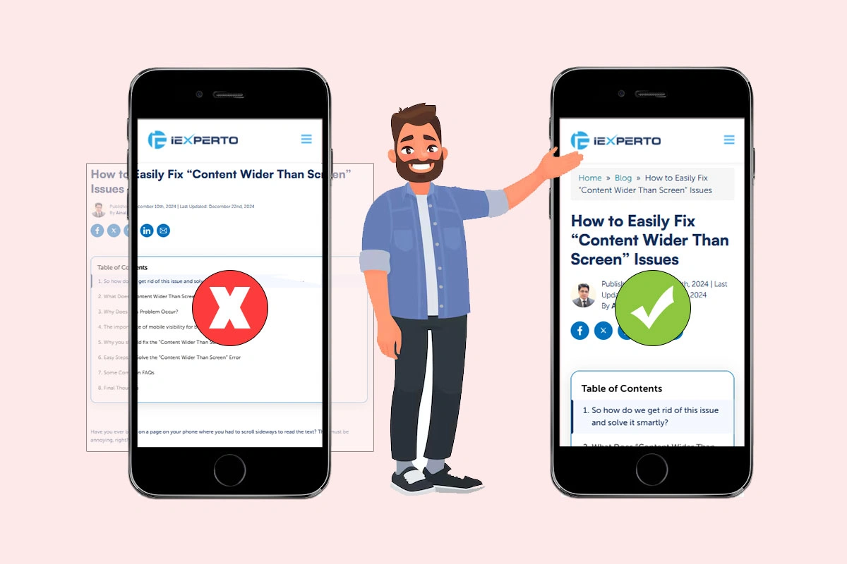
Have you ever been on a page on your phone where you had to scroll sideways to read the text? That must be annoying, right?
This common problem, called “content wider than screen,” harms the user experience and can even hurt your search engine ranking.
Statcounter studies show that more than 60% of all web traffic now comes from mobile devices. A website that makes users zoom in and out or move sideways on their phones annoys them and makes them leave.
So how do we get rid of this issue and solve it smartly?
Don’t worry, though! We’ll show you some easy ways to fix this issue and make sure your website looks great on all devices in this blog post.
But before that, let’s learn a bit more about this issue!
What Does “Content Wider Than Screen” Mean?
There must be different technical theories or explanations out there online to understand this major CSS issue. But we’ll try to explain it in a simple way.
Suppose you have entered a website from your mobile device. After you land on the web page, you see a big or unoptimized photo. Your phone screen can only show a small part of it at a time. To see the rest of the image, you have to scroll right or left. And this is called “Content Wider Than Screen”.
When the website’s stuff – pictures, text, everything – is too big to fit comfortably, it makes it annoying to use.
Why Does This Problem Occur?
There are some obvious reasons behind this error. SEO strategies are being updated day by day. Those outdated strategies, like using fixed-width image sizes, irresponsive design formats, or optimized images, are no longer part of good SEO strategies.
For your help, here we have compiled four major reasons for you.
- Fixed-width design: Previously, websites were often designed for a single screen size, typically a larger desktop monitor. This design approach uses fixed pixel values for the width of elements like images and text boxes. The problem is, these elements don’t shrink down on smaller screens like phone displays, causing them to spill over the sides and require horizontal scrolling.
- Not using responsive design: Using responsive design is a new way to build websites. Sites that are responsive use media queries and flexible layouts to change the layout automatically based on the device being used. Different screen sizes will not be able to change how a website looks if it was not made with responsive design. This is what causes the “Content Wider Than Screen” problem.
- Large images that aren’t responsively scaled: If website images aren’t optimised for different screen sizes, even if the layout is responsive, problems can happen. Even if the layout changes, very big images can still be hard to see on smaller screens. Images should be resized or compressed so that they look good on all kinds of devices.
- Third-party plugins or embeds: Websites will sometimes use plugins or embeds that come from other sources. These parts of the website might not be responsive by nature, and they can mess up the layout on mobile devices, causing information to go beyond the width of the screen.
The importance of mobile visibility for better user experience
We all know that most online users are on mobile devices. It’s estimated that more than 60% of users tend to use their mobile phones while browsing the internet. So if you’re not giving much effort to your site’s mobile responsiveness, then you’re surely missing out on something crucial.
Therefore, if you want your business to thrive and prosper on Google, you have to take care of it by following the proven strategies yourself and hiring an expert.
What’s more? Here we have prioritized why mobile visibility is crucial for crafting a fantastic user experience overall, impacting website performance.
a. Mobile users are so many:
Statistics tell the tale. Over 60% of web traffic now originates from mobile devices [source: Statcounter]. That means a significant portion of your potential audience is encountering your website on a small screen. If your site isn’t optimized for mobile, they’re likely to bounce away in frustration.
b. For user satisfaction:
Imagine trying to read a newspaper shrunk to fit a phone screen. That’s the frustration users face with websites that lack mobile visibility. A mobile-friendly design with clear menus, easy-to-read text, and properly sized buttons ensures a smooth and enjoyable experience for your visitors.
c. It can improve conversion rates:
A positive user experience directly translates to better business outcomes. When users can easily navigate your website, find the information they need, and take desired actions (like making a purchase) on their phones, conversion rates soar.
d. Boosts SEO efforts:
Search engines like Google prioritize mobile-friendly websites in search results. This means a website that displays well on mobile devices is more likely to rank higher in searches, increasing your organic traffic and brand visibility.
e. Helpful for bounce rates:
Have you ever clicked on a website on your phone only to see a clumsy, unreadable mess? Most users simply hit the back button and move on. A mobile-optimized website reduces bounce rates, keeping visitors engaged and exploring your content.
Why you should fix the “Content Wider Than Screen” error
As of now, you probably understand the basics of the “content wider than screen” error and its importance for a website to perform well. As a part of the SEO effort, you must consider this
a. Bad user experience (UX)
Imagine trying to read a newspaper that’s been folded in half. That’s the frustration users face with websites that don’t adapt to their phone screens.
Text appears tiny, buttons are impossible to tap, and users have to scroll horizontally just to see the full content. This clunky experience leads to user frustration, and frustrated users simply leave.
Studies show that 88% of users are less likely to return to a website after a bad mobile experience.
b. Hard to make any conversions
A website’s primary goal is often to convert visitors into paying customers or subscribers. If your website forces users to fight with the layout on their phones, forget about conversions.
Imagine trying to buy something on a website where the “Add to Cart” button is hidden off-screen. Frustrated users will abandon their carts and head to a competitor’s website that offers a smooth mobile experience.
c. Gives SEO penalty
Search engines like Google prioritize mobile-friendliness when ranking websites. A website that displays poorly on smartphones and tablets will be penalized in search results, making it harder for potential customers to find you.
Fixing the “content wider than screen” error ensures your website displays perfectly on all devices, giving you a fighting chance for those coveted top search rankings.
d. Hamper brand credibility
In today’s digital age, a website is often a brand’s first impression. A website riddled with mobile display issues sends a message of carelessness and lack of professionalism.
By addressing the “content wider than screen” error, you demonstrate that you value your mobile audience and care about providing a positive user experience, which in turn fosters brand trust and credibility.
e. Frustrated users mean increased bounce rates
Bounce rate refers to the percentage of visitors who leave your website after viewing only one page. A website with “content wider than screen” issues will see a dramatic increase in bounce rates.
Users simply won’t bother navigating a website that’s difficult to use on their phones. High bounce rates not only hurt your user engagement but also signal to search engines that your website might not be relevant, potentially impacting your ranking.
Easy Steps to Solve the “Content Wider Than Screen” Error
The “Content Wider Than Screen” error occurs when a webpage’s content isn’t designed to adjust to different screen sizes, causing users on mobile devices to scroll horizontally to see everything. This can be frustrating and lead to a poor user experience.
Luckily, there are some certain ways that you can take to fix this issue:
Tip one: Identify the root cause
The first step is to pinpoint which web pages on your site are causing the problem. You can use Google Search Console’s mobile usability report to identify these pages.
This report crawls your site and flags any usability issues, including content width problems.
Here’s the snapshot of the Google Search Console page to see the affected page
Tip two: Use Responsive Web Design
The next tip is for you to utilize responsive web design once you find the main cause from the Google search console. Responsive web design (RWD) is a design strategy to make your website adapt to any screen size (desktop, mobile, or tablet).
So if you can implement the right responsive web design, your website will automatically adjust its layout and content width to fit the user’s device.
Let’s get deep into this matter:
Flexible units: Instead of fixed pixel or point sizes, use relative units like percentages (%) or viewport units (vw, vh) to define element widths. This allows elements to scale based on the screen size.
For example, replace them with percentages (e.g., width: 70% instead of width: 700px). Using viewport units like vw (viewport width) for more flexible sizing.
Media queries: Media queries are CSS code snippets that allow you to apply different styles to your website depending on the screen size. For instance, you could have a style rule that sets a specific width for content on screens wider than 768px (tablets) and a different rule for screens narrower than 768px (smartphones).
Tip three: Adjust image scaling
Images wider than the screen can be a major culprit behind this error. To fix this, ensure your images are set to scale automatically. You can achieve this by setting a maximum width of 100% for your images in your CSS. This ensures the image won’t overflow the screen’s width.
For example: Add the following property within those sections: max-width: 100%;
Tip four: Flexbox CSS layout
Flexbox is a powerful CSS layout model that makes it easier to create flexible and responsive layouts. Using Flexbox, you can easily define how elements should resize and align within their container, ensuring everything fits well on various screen sizes.
Tip five: Refine media query breakpoints
Media query breakpoints are the points at which your website’s layout changes depending on screen size. You might need to adjust these breakpoints to ensure your content displays well on a wider range of devices.
Tools like Google’s Mobile-Friendly Test can help you test your website on different devices and identify any layout issues. Just enter your URL and then click on the analyze button to complete the entire analysis.
You’ll get a full overview of which section needs updates or modifications.

You can do it either way by using the Google Lighthouse feature. Just stay on your preferred website and click on the inspect elements. Here it’s you’ll find the tool developer by Google also.

One by one check the errors and fix them smartly. Then you will notice the changes gradually.
Tip six: Validate all fixes
Now this is the most important portion of the entire process. You need to validate your fixes and let Google know about the changes to address the “Content Wider Than Screen” error. You can also use Google’s Mobile-Friendly Test again to confirm that the issue has been resolved.
On the other hand, you can navigate to the Google search console again, and test the page individually to see whether your pages are resolved or not.

If you see the affected pages resolved with a “Green Tick Mark”, then you can stay confident that the issue is solved.
Some additional considerations to reduce the error
Here we have some additional tips for you to follow alongside these tips. It will provide you a compact outcomes in the end.
Here are they:
- Try to use a theme that is easy to configure and customize.
- Take expert advice before you start designing your website.
- Design or implement your strategies in the local server first. And then launch it on the main server.
- Use a good hosting service provider. Because your hosting server panel’s speed matters a lot.
- Check your site’s health from time to time to see if anything unwanted things are happening or not.
- Don’t forget to check the compatibility of third-party tools you use like plugins, themes, etc.
- And lastly, plan smartly and implement wisely.
Some Common FAQs
01. Why is this error bad?
Horizontal scrolling creates a clunky user experience on mobile devices. It can frustrate users and lead them to abandon your website.
02. How can I identify if my website has this error?
You can use Google Search Console’s mobile usability report. This report crawls your site and flags any usability issues, including content width problems.
03. Do I need a developer to fix this error?
Basic fixes might be manageable with some CSS knowledge. However, for complex website structures or extensive changes, a developer’s expertise might be recommended.
04. What happens if I don’t fix this error?
Your website will be less user-friendly for mobile visitors. This can hurt your search engine ranking and mobile conversion rates.
Final Thoughts
Although the tips provided above can be a quick solution, it is highly recommended to implement responsive web design (RWD) for a website that is visible to all devices.
RWD allows your website to automatically adjust its layout for optimal viewing on any screen size. You can consider consulting a web developer to explore RWD options and create a website that delivers a seamless experience for all your visitors.
In the meantime, go ahead and try the solutions above! Even these small tweaks can make a big difference in how users experience your website on their mobile devices.


