RESPONSIVE WEB DESIGN Services
Iexperto specializes in creating high-performance responsive websites and web portals that elevate your digital presence. Our designs feature intuitive navigation, mobile-optimized interactive elements, and seamless performance across all screen sizes.

Our Services

Responsive Custom Website Development
All our websites are custom developed with responsive designs at its core to guarantee that they perform fluidly across various devices.

Mobile-First Approach
Understanding that a large portion of the user base engages websites using mobile phones, our responsive websites are built with adaptability to various devices and screen sizes as our focus.

Wireframing & Prototyping for Different Devices
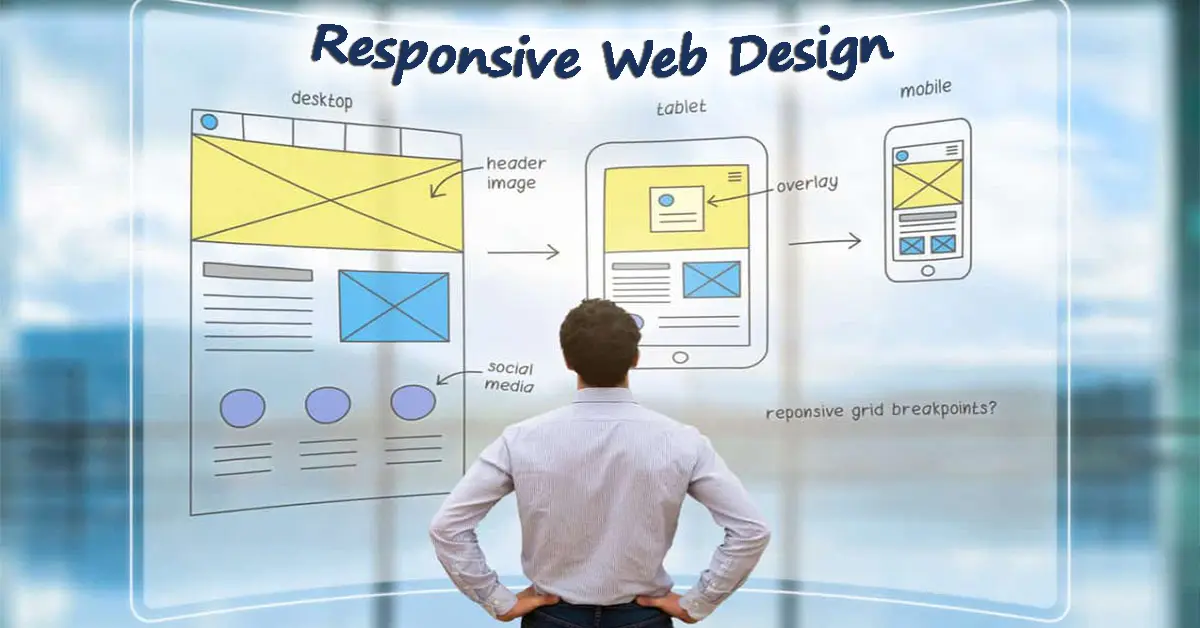
During our design phase, we present wireframes and prototypes for a variety of screen sizes to give you a clear vision of what your website will look like across multiple devices.

Responsive UI Component Design
Our responsive design team experts use media queries while designing UI components to create flexible interfaces with high performance.

Usability Testing on Multiple Devices
We thoroughly test our websites on multiple devices during production to accommodate for users on any device, setting a standard for ease of use, functionality, and user satisfaction.

Responsive Image Optimization
Part of our responsive development process is to optimize images and other media content to improve loading times and create the most responsive platforms we can.
WHY IS RESPONSIVE WEB DESIGN A MUST?
Mobile-friendly:
A responsive design is necessary to give consumers that use the internet on their mobile phones a seamless experience in terms of sizing and speed.
Create Content Without Any Hassle:
Setting up websites with responsive themes allows content creators to create and publish content that conforms to the responsive behaviour of the rest of their website.
Flexible:
A responsive website is flexible enough to accommodate all screen sizes and orientations, cleanly displaying your website across various devices.
Improves the Loading Time:
Developing responsive websites using elements like flexible images and fluid grids reduces the time pages take to load, improving overall website performance.
Better User Experience:
Engaging with responsive designs as a user means enjoying faster websites that fit well on your screen, providing increased usability and satisfaction.
Lower Bounce Rates
Implementing responsive designs to improve user engagement results in lower bounce rates as viewers enjoy their experience more.
Better SEO Rankings:
SEO is crucial to responsive design and development as search engines like Google prioritize mobile-friendly websites especially for the Toronto market.
Future Proofing
As new devices and screen sizes continue to emerge, responsive designs ensure your website adapts to advancements in technology easily.
Enhance User Visibility in Search Engines:
A responsive website improves SEO by using a single URL for every version, which allows search engines algorithms to assign indexing properties accurately.
Our Process
Our process begins with having detailed conversations with our clients to gain a deeper understanding of your business, its objectives and target audience, allowing us to create a strategy for a responsive website unique to your needs.
We develop a comprehensive user experience strategy based on research and user insights, ensuring your website not only looks great but also provides an intuitive and efficient journey for your visitors.
We then create detailed mockups, wireframes and prototypes that give you a representation of what your design looks like on various screen sizes – optimized for responsiveness and user experience.
At this stage, we collaborate closely with you to refine the design, ensuring it aligns with your vision and meets user needs.
Once the designs have been approved, our responsive design team experts transform these designs into functional code, optimized for fluidity and flexibility across various devices.
Continuous testing across a variety of devices is regularly conducted to provide a consistent user experience regardless of the viewing platform.
Every element of the website is continuously optimized before launch to account for speed, SEO and responsiveness for the ultimate viewing experience.
Post-launch, we continue to monitor key website vitals and metrics to make any updates or adjustments required to maintain responsiveness or recent changes in technology.
Improve User Experience, Increase 20% Conversions with Responsive Web Design
Our responsive web design service optimizes your website for all devices, ensuring seamless navigation and fast loading times. By adapting to various screen sizes, we enhance user engagement and satisfaction. Our data-driven approach focuses on intuitive layouts, clear calls-to-action, and streamlined content, driving a significant boost in conversion rates.
Speak with Our Responsive Web Design Experts


FAQs
What is responsive web design (RWD)
How does responsive web design work?
Can responsive web design improve website speed?
What should be considered when designing a responsive website?
How can I test my website for responsiveness?
How much does a custom responsive website typically cost compared to one built from a template?

