


By: Nahida Haque /
04 May 2018
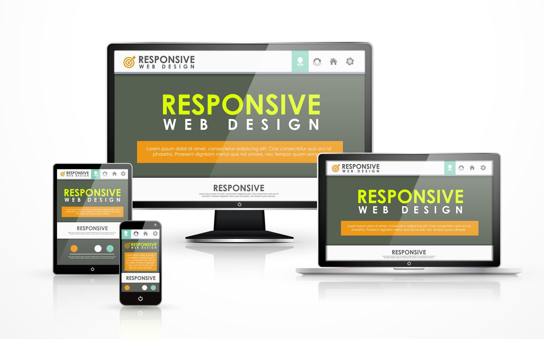
When a web design is responsive, that means that the site can change to fit in with the device or varying viewport sizes used by your customers. Therefore, the site will be adaptable so that your customers can enjoy your site at its best on whichever device they choose to use. This means that your customers can experience speedy loading at the right size to be viewed optimally.
Whereas the majority of customers mainly accessed web content via a desktop computer until the 2000s, nowadays people use a wider variety of devices. As a range of tablets and smartphones have become widespread, customers are now accessing websites with a higher range of viewports.
Therefore, to keep up with the changes in technology and devices, a website needs to be flexible so that it can be viewed on any device without the need to resize. For this reason, companies that do not invest in responsive web design are making their sites inaccessible to a large number of potential clients. As you can imagine, in an online world this can have a significant negative impact on the growth of the company.
Still Not Convinced? Here Are 10 Great Benefits Of Using Responsive Web Design For Your Business Website.
1. More Traffic From Mobile Devices
Nowadays, more than half of online customers use a mobile device as their main way to browse products and make purchasing decisions. Therefore, it’s vital that your site can be viewed properly on mobile devices without the user having to resize elements of the site or enduring long loading times. These frustrations could put this huge potential client base off using your site.
Of course, you could simply choose to have a mobile version of your site for users to access when they’re on mobile devices. However, responsive design is still more desirable as it offers greater flexibility and at a lower overall cost to you.
2. Lower Cost to You
As a rule, creating one adaptable website using responsive design is quicker and cheaper than creating one version for smartphone and tablet and another for desktop users. Therefore, this makes it a more cost-effective option. Even if you end up shelling out more at first for a responsive site, consider this: in future, you will have only one and not two websites to maintain. Therefore, you should end up saving in the long-run.
3. Reduced Fees To Maintain Your Site
As we mentioned above, maintaining one responsive website is cheaper than trying to maintain a desktop and mobile version separately. This also makes the job much simpler and quicker for the team managing your website maintenance. Therefore, this allows you to redirect your focus to other important aspects of your business.
4. Speedier loading
When websites take a long time to load, it’s highly likely that your user will become annoyed, give up and go elsewhere. If you have a website that isn’t designed for use on mobile devices, this can lead to long loading times for mobile users and potential loss of business. A responsive site that is optimized for mobile use helps to solve this problem and ensures that your users experience quick loading times.
5. Converts More New Customers
When a customer is using your website on a mobile device, the last thing they want is to experience a sub-optimal layout or have to navigate to different mobile-friendly versions of your site. Add this to the slow loading times experienced on non-responsive sites by mobile users and this can all get very irritating, very quickly. Therefore, a website not optimized for mobile users can actually drive them towards your competition. So, a responsive site that looks slick and works seamlessly on any device makes the best impression and makes users more likely to purchase.
6. Less ‘bouncing’
When your site is designed in a responsive way, this makes it much easier and more enjoyable for users, especially the huge numbers using mobile devices. Therefore, this means that your customer will feel more positively towards your website and may stick around for longer to browse your site in more detail. This all leads to lower bounce rates.
7. Simpler to Analyse Performance
Analytics for websites is important. It tells you more information about how people use your site and whether the site is fulfilling the goals you have for your business. However, if you have a separate mobile version of your site, this essentially means running analytics on both sites. This can be long-winded and time-consuming. Responsive websites are much simpler and quicker to monitor, saving you both time and money.
8. More Positive Experiences For Your Customers
As many customers’ first experience of you as a company is through your website, you’ll want to make sure that this initial impression is as professional and seamless as possible. When your site optimizes automatically to suit the user’s viewport and loads quickly and efficiently, this makes it more likely that they will form a positive opinion of your business. Therefore, this increases the likelihood that they will become a customer and even recommend you to others.
9. Better SEO Rankings
When potential customers search for keywords relating to your business, you want to pop up near the top of the search results. Therefore, you need your website to work in your favour when it comes to SEO. Responsive sites are better for your SEO rankings for various reasons, for example, because they tend to provide higher user satisfaction and therefore lower bounce rates. Also, having a mobile version of your site means that content will be duplicated across two versions of your site. This can lower your SEO rankings.
10. Helps Your Website Look to The Future
Nowadays, new mobile devices are being released all the time. Not so long ago, most of us could barely have imagined the enormous variety of smartphones and tablets that are now pretty mainstream. With manufacturers constantly developing and releasing more modern versions, your website will need to be adaptable to these new technological advances. Responsive design means that your site should be able to cope with whatever future technology throws at it.
Are you considering responsive design for a new website, or thinking of a redesign for your existing business? At iExperto, our experts can help you with all aspects of designing and maintaining responsive websites to give your customers a seamless experience and help your business to grow. Contact us through our website at iexperto.ca to start your journey towards responsive website design today.